
Photo by Steve Pham
Deputy Editor
Welcome to this year’s Dream Designs package, our annual celebration of the most beautiful and functional aquatics spaces around the globe.
Every year, I like to share the lessons I’ve learned from these examples of first-class design, as solid design principles and strategies can transcend budget. Some of the highlights:
“Wellness” is more than a term of art.
While we often hear that wellness is taking an important spot in consumers’ consciousness, our first honoree offers physical proof of just how woven this concept is becoming into the fabric of our society. 3Roots Fit & Rec Wellness Center Pools is a recreation and aquatics facility in Mira Mesa, Calif. Developed as part of an upscale planned community, it lists the wellness of its residents as its first mission. The complex offers plenty of opportunities for family fun, but a distinct spa vibe pervades, with high-minded design elements such as a 50-ft-tall ficus tree that grows through an opening in the roof’s overhang to symbolize the coming together of nature and architecture.
Water softens and smooths the edges.
Water elements just make everything better. Nobody knows that better than we do. Whether it be a community pool, ornamental water feature, or an engineered lagoon, they enhance the lives of all who come in contact with them.
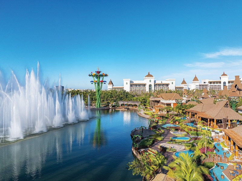
But I loved how the team explained the specific design function of its lakes, pools, and water fountains within the expansive resort/amusement/entertainment complex called Parque Vidanta (pictured), set in a planned community about 12 miles up the coast from Puerto Vallarta. They referred to the water as connective tissue, bringing together the built architectural structures with the nature and intentional landscaping that they hoped to showcase. Look at the dynamic way they accomplished this.
How to have your cake and eat it too.
When I first began writing on the aquatics and pool/spa industries, the vast majority of commercial pools looked quite institutional. Grays and beiges were the rule of the day, with little to no ornamentation in sight. Then we went through the phase where everything came in primary colors—not to say anything’s wrong with that, but not for everything. Now the industry has found new ways to work with palettes that can add excitement without crossing into the whimsical or juvenile when it’s not called for. So even legitimately institutional pools rarely look that way. And resort pool designers find ways to maintain an elegant aura while appealing to the kiddos.
It seems that some have come across a formula perfectly emulated by at least two of our Dream Designs honorees: The use of subtle or even neutral tones as the foundation on large surfaces and structures, while leaving it to the more easily replaced or repainted accents to introduce color and excitement. In the case of Margaritaville Kansas City, designers needed to carry through the laid-back branding inspired by the Jimmy Buffett song after which the resort chain is named. (Check out the lime slices.) However, it needed a resort feel. The designers of OKANA Resort and Waterpark in Oklahoma City, Okla. had a similar objective, incorporating the vibrant colors
that represent the Chickasaw Nation with an underlying high-end feel.
Enjoy this year’s Dream Designs. I can’t wait to see what masterpieces the industry creates this year.